8.7 KiB
booru-viewer Theme Reference
Copy any .qss file from this folder to your data directory as custom.qss:
- Linux:
~/.local/share/booru-viewer/custom.qss - Windows:
%APPDATA%\booru-viewer\custom.qss
Restart the app after changing themes.
Included Themes
| Theme | File | Preview |
|---|---|---|
| Nord | nord.qss | 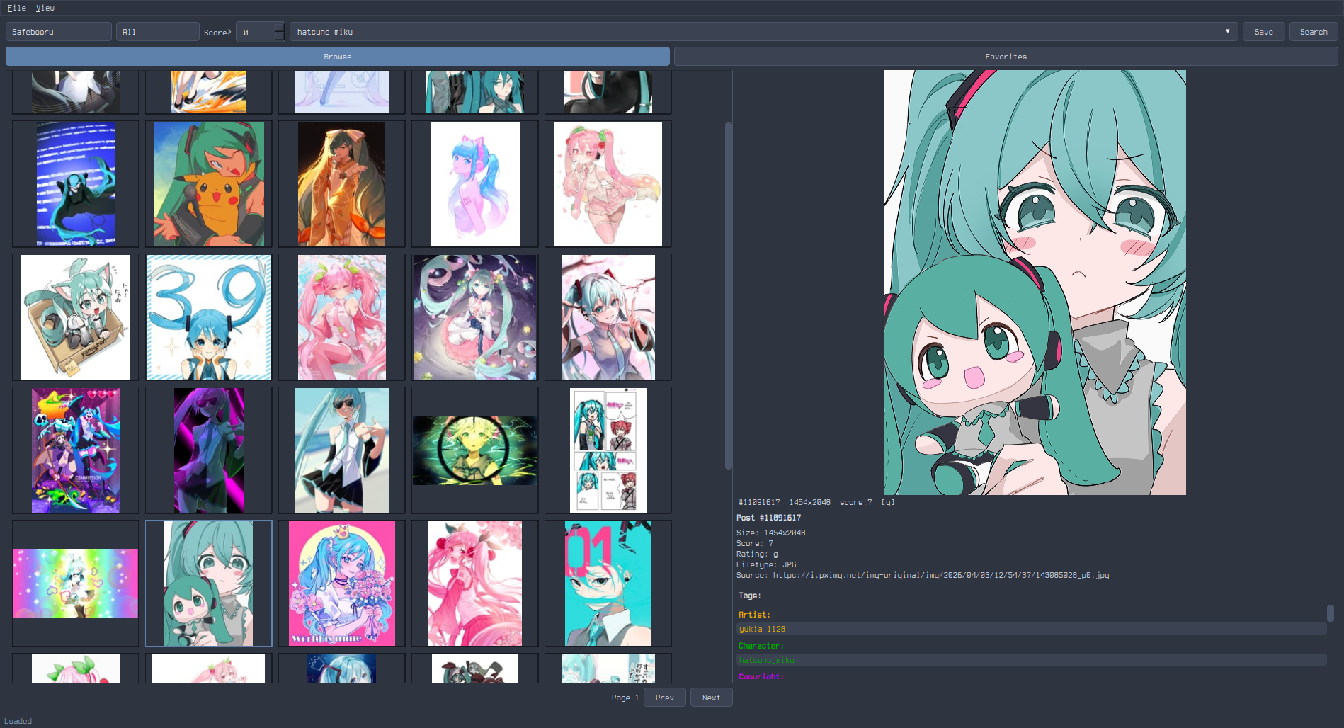 |
| Catppuccin Mocha | catppuccin-mocha.qss | 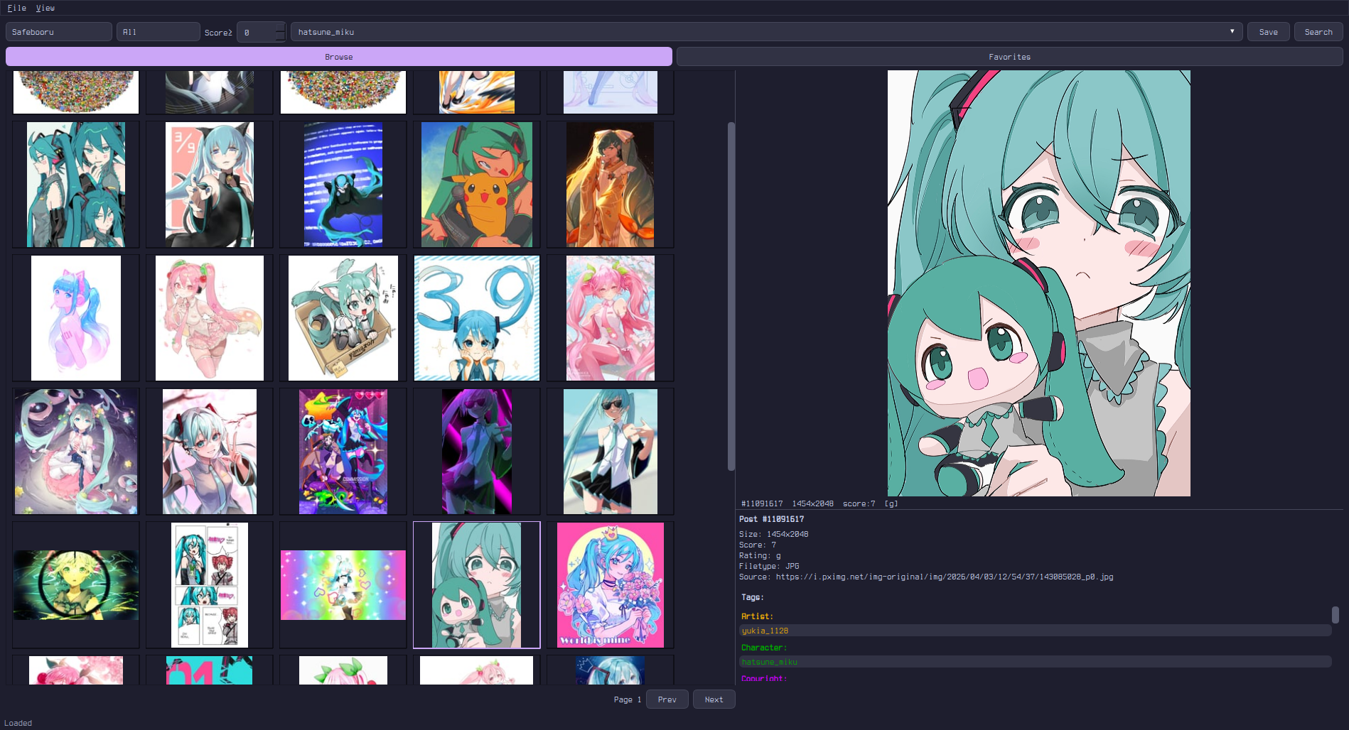 |
| Gruvbox | gruvbox.qss | 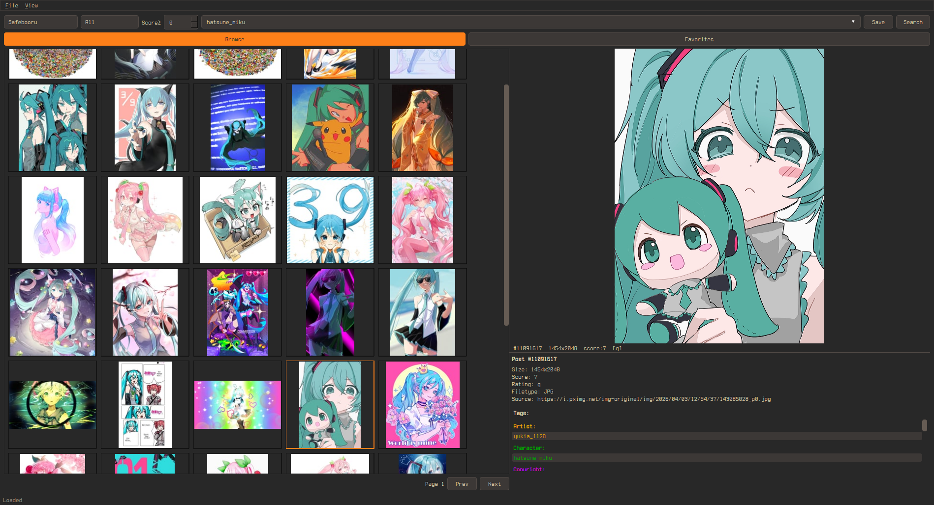 |
| Solarized Dark | solarized-dark.qss | 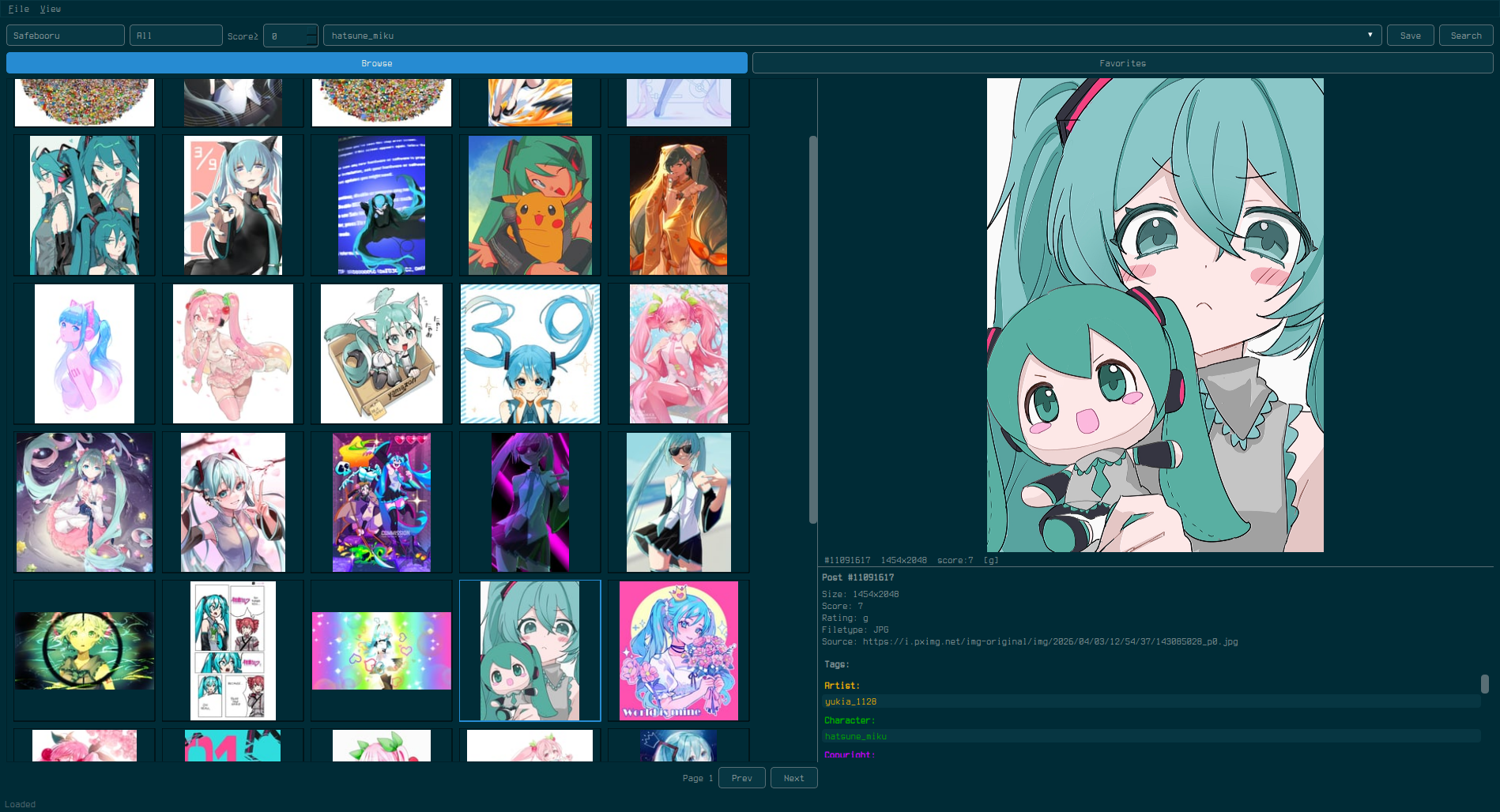 |
| Tokyo Night | tokyo-night.qss | 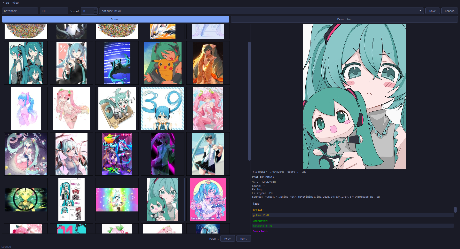 |
| Everforest | everforest.qss | 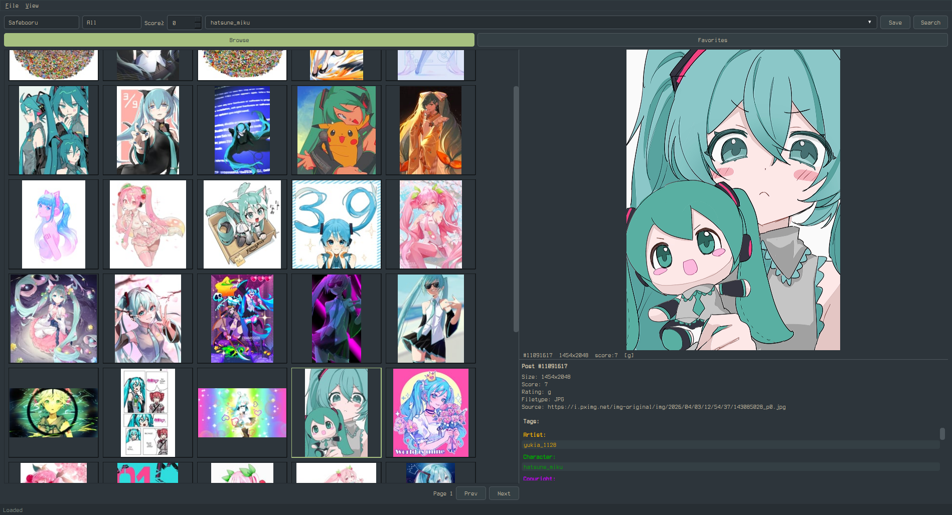 |
Widget Targets
Global
QWidget {
    background-color: #282828;
    color: #ebdbb2;
    font-size: 13px;
    font-family: monospace;
    selection-background-color: #fe8019;  /* grid selection border + hover highlight */
    selection-color: #282828;
}
Buttons
QPushButton {
    background-color: #333;
    color: #fff;
    border: 1px solid #555;
    border-radius: 4px;
    padding: 5px 14px;
}
QPushButton:hover { background-color: #444; }
QPushButton:pressed { background-color: #555; }
QPushButton:checked { background-color: #0078d7; }  /* Active tab (Browse/Bookmarks/Library), Autoplay, Loop toggles */
Note: Qt's QSS does not support the CSS content property, so you cannot replace button text (e.g. "Play" → "") via stylesheet alone. However, you can use a Nerd Font to change how unicode characters render:
QPushButton {
    font-family: "JetBrainsMono Nerd Font", monospace;
}
To use icon buttons, you would need to modify the Python source code directly — the button labels are set in preview.py via QPushButton("Play") etc.
Text Inputs
QLineEdit, QTextEdit {
    background-color: #1a1a1a;
    color: #fff;
    border: 1px solid #555;
    border-radius: 4px;
    padding: 4px 8px;
}
QLineEdit:focus, QTextEdit:focus {
    border-color: #0078d7;
}
Dropdowns
QComboBox {
    background-color: #333;
    color: #fff;
    border: 1px solid #555;
    border-radius: 4px;
    padding: 3px 6px;
}
QComboBox::drop-down {
    border: none;
    width: 20px;
}
QComboBox QAbstractItemView {
    background-color: #333;
    color: #fff;
    border: 1px solid #555;
    selection-background-color: #444;
}
Spin Box (Score Filter)
QSpinBox {
    background-color: #333;
    color: #fff;
    border: 1px solid #555;
    border-radius: 2px;
}
Scrollbars
QScrollBar:vertical {
    background: #1a1a1a;
    width: 10px;
    border: none;
}
QScrollBar::handle:vertical {
    background: #555;
    border-radius: 4px;
    min-height: 20px;
}
QScrollBar::handle:vertical:hover { background: #0078d7; }
QScrollBar::add-line:vertical, QScrollBar::sub-line:vertical { height: 0; }

QScrollBar:horizontal {
    background: #1a1a1a;
    height: 10px;
}
QScrollBar::handle:horizontal {
    background: #555;
    border-radius: 4px;
}
QScrollBar::add-line:horizontal, QScrollBar::sub-line:horizontal { width: 0; }
Menu Bar & Context Menus
QMenuBar {
    background-color: #1a1a1a;
    color: #fff;
}
QMenuBar::item:selected { background-color: #333; }

QMenu {
    background-color: #1a1a1a;
    color: #fff;
    border: 1px solid #333;
}
QMenu::item:selected { background-color: #333; }
Status Bar
QStatusBar {
    background-color: #1a1a1a;
    color: #888;
}
Splitter Handle
QSplitter::handle {
    background: #555;
    width: 2px;
}
Tab Bar (Settings Dialog)
QTabBar::tab {
    background: #333;
    color: #fff;
    border: 1px solid #555;
    padding: 6px 16px;
}
QTabBar::tab:selected {
    background: #444;
    color: #0078d7;
}
Video Player Controls
The preview panel's video controls bar uses a translucent overlay style by default (rgba(0,0,0,160) background, white text). This is styled internally and overrides QSS for the controls bar. The seek/volume sliders and buttons inside the controls bar use a built-in dark overlay theme.
To override the preview controls bar background in QSS:
QWidget#_preview_controls {
    background: rgba(40, 40, 40, 200);  /* your custom translucent bg */
}
Standard slider styling still applies outside the controls bar:
QSlider::groove:horizontal {
    background: #333;
    height: 4px;
    border-radius: 2px;
}
QSlider::handle:horizontal {
    background: #0078d7;
    width: 12px;
    margin: -4px 0;
    border-radius: 6px;
}
Popout Overlay
The popout (fullscreen preview) toolbar and video controls float over the media with a translucent background and auto-hide after 2 seconds of no mouse activity. Mouse movement or Ctrl+H toggles them.
These overlays use internal styling that overrides QSS. To customize:
/* Popout top toolbar */
QWidget#_slideshow_toolbar {
    background: rgba(40, 40, 40, 200);
}

/* Popout bottom video controls */
QWidget#_slideshow_controls {
    background: rgba(40, 40, 40, 200);
}
Buttons and labels inside both overlays inherit a white-on-transparent style. To override:
QWidget#_slideshow_toolbar QPushButton {
    border: 1px solid rgba(255, 255, 255, 120);
    color: #ccc;
}
QWidget#_slideshow_controls QPushButton {
    border: 1px solid rgba(255, 255, 255, 120);
    color: #ccc;
}
Preview Toolbar
The preview panel has an action toolbar (Bookmark, Save, BL Tag, BL Post, Popout) that appears above the media when a post is active. This toolbar uses the app's default button styling.
The toolbar does not have a named object ID — it inherits the app's QPushButton styles directly.
Progress Bar (Download)
QProgressBar {
    background-color: #333;
    border: none;
}
QProgressBar::chunk {
    background-color: #0078d7;
}
Tooltips
QToolTip {
    background-color: #333;
    color: #fff;
    border: 1px solid #555;
    padding: 4px;
}
Labels
QLabel {
    background: transparent;  /* important: prevents opaque label backgrounds */
}
Rubber Band Selection
Click and drag on empty grid space to select multiple thumbnails. The rubber band uses the system's default QRubberBand style, which can be customized:
QRubberBand {
    background: rgba(0, 120, 215, 40);
    border: 1px solid #0078d7;
}
Thumbnail Indicators
ThumbnailWidget {
    qproperty-savedColor: #22cc22;       /* green dot: saved to library */
    qproperty-bookmarkedColor: #ffcc00;  /* yellow star: bookmarked */
}
Info Panel Tag Categories
The tag list in the info panel groups tags by category and colors each
category. Defaults follow the booru convention (Danbooru, Gelbooru, etc.)
so the panel reads naturally to anyone coming from a booru site. Override
any of them via qproperty-tag<Category>Color on InfoPanel:
InfoPanel {
    qproperty-tagArtistColor: #f2ac08;     /* default: orange */
    qproperty-tagCharacterColor: #00aa00;  /* default: green (booru convention) */
    qproperty-tagCopyrightColor: #cc00ff;  /* default: magenta */
    qproperty-tagSpeciesColor: #ee4444;    /* default: red */
    qproperty-tagMetaColor: #888888;       /* default: gray */
    qproperty-tagLoreColor: #888888;       /* default: gray */
}
The General category has no color override — its tags use the panel's default text color so they fall in line with the rest of the theme.
States
| State | Description |
|---|---|
:hover |
Mouse over |
:pressed |
Mouse down |
:focus |
Keyboard focus |
:checked |
Toggle buttons (Browse/Favorites) |
:selected |
Selected menu item or tab |
:disabled |
Grayed out |
Notes
selection-background-coloronQWidgetcontrols the grid thumbnail selection border and hover highlight (lighter version auto-derived)- Setting a custom QSS automatically switches to the Fusion Qt style for consistent rendering
- Tag category colors (Artist, Character, Copyright, Species, Meta, Lore) are QSS-controllable via
qproperty-tag<Category>ColoronInfoPanel— see the Info Panel Tag Categories section above - Saved dot (green) and bookmark star (yellow) are QSS-controllable via
qproperty-savedColorandqproperty-bookmarkedColoronThumbnailWidget - Use
QLabel { background: transparent; }to prevent labels from getting opaque backgrounds