 pax
0ec72f41fa
pax
0ec72f41fa
Extract text and background colors from QSS and set palette roles
(ButtonText, WindowText, Button) so Fusion draws arrows in the
correct color. Removed broken spinbox button overrides from themes.
booru-viewer Theme Reference
Copy any .qss file from this folder to your data directory as custom.qss:
- Linux:
~/.local/share/booru-viewer/custom.qss - Windows:
%APPDATA%\booru-viewer\custom.qss
Restart the app after changing themes.
Included Themes
| Theme | File | Preview |
|---|---|---|
| Nord | nord.qss | 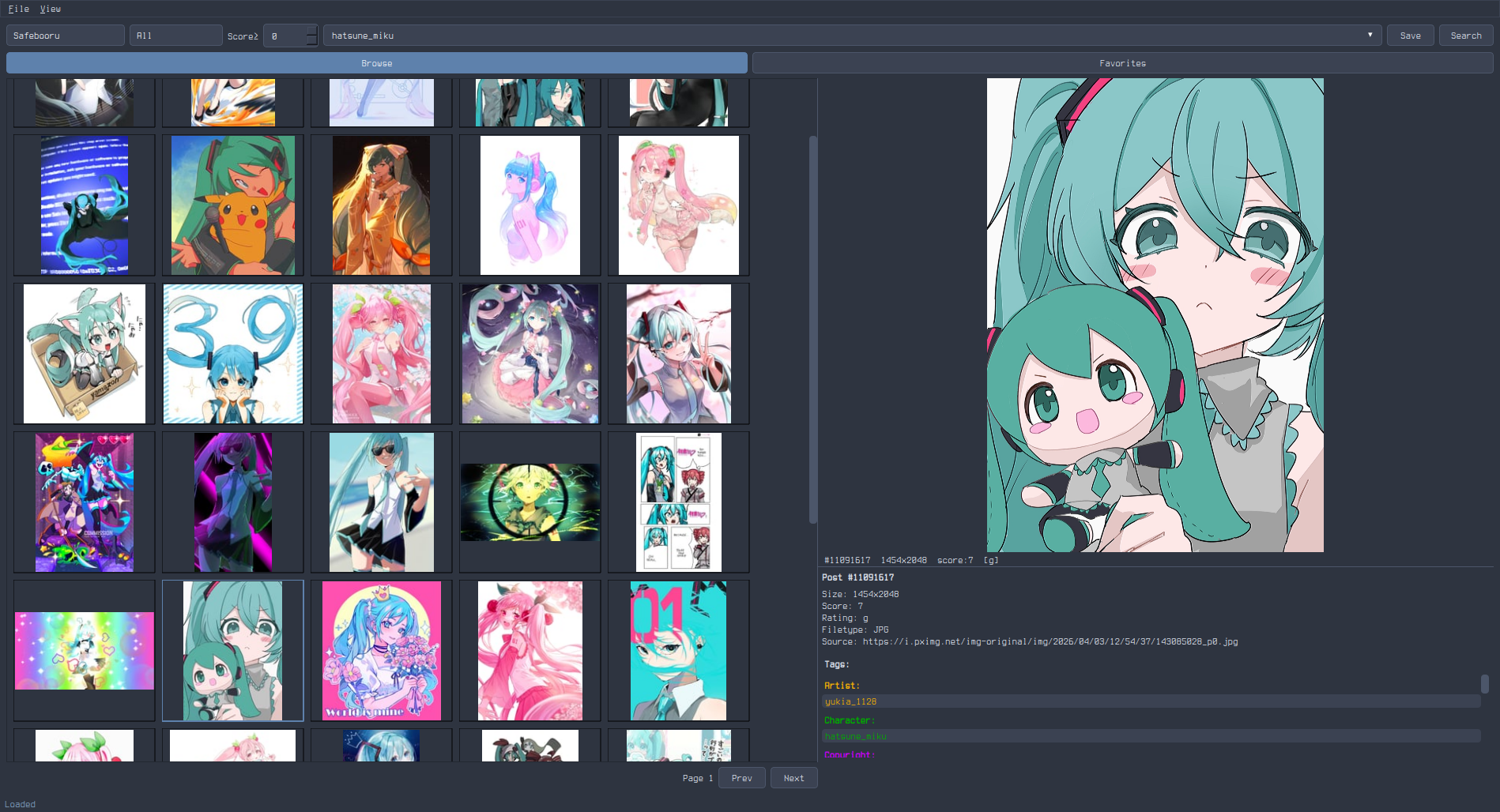 |
| Catppuccin Mocha | catppuccin-mocha.qss | 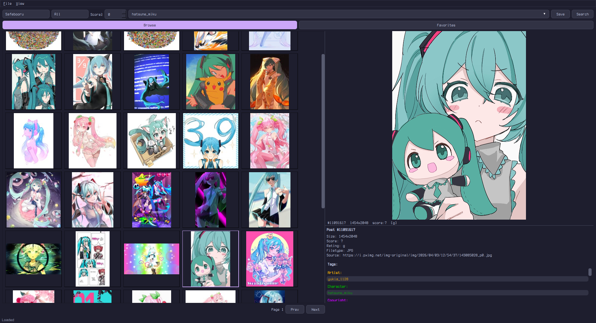 |
| Gruvbox | gruvbox.qss | 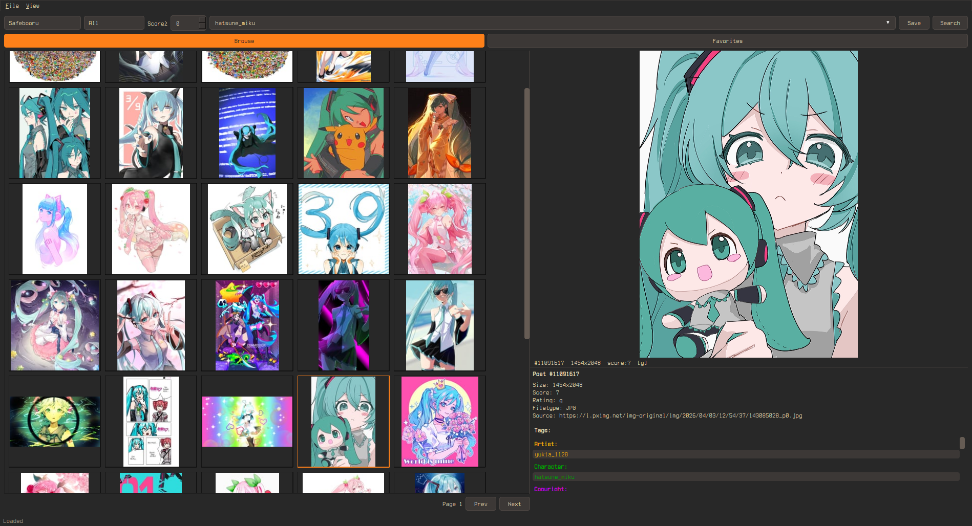 |
| Solarized Dark | solarized-dark.qss | 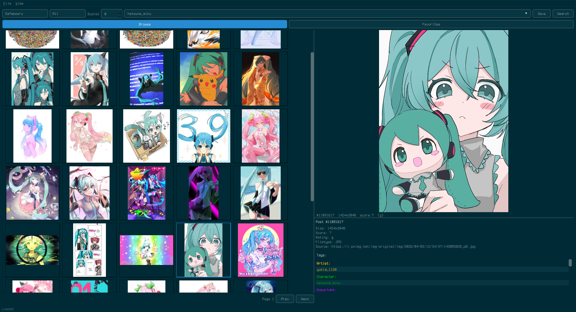 |
| Tokyo Night | tokyo-night.qss | 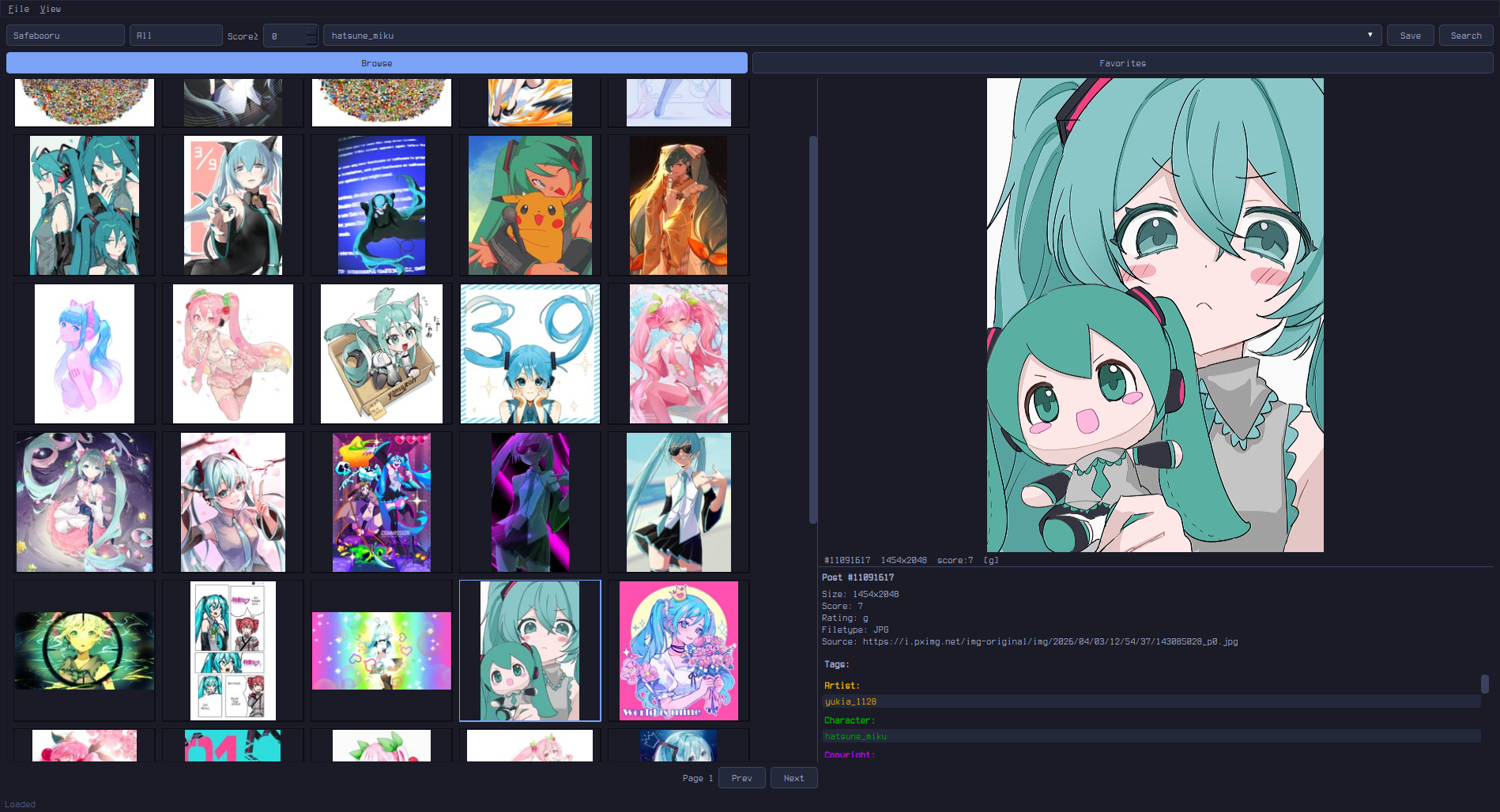 |
| Everforest | everforest.qss | 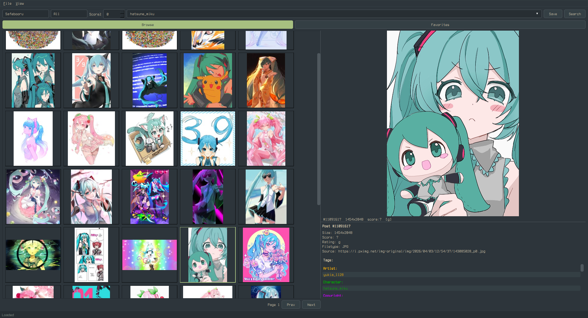 |
Widget Targets
Global
QWidget {
    background-color: #282828;
    color: #ebdbb2;
    font-size: 13px;
    font-family: monospace;
    selection-background-color: #fe8019;  /* grid selection border + hover highlight */
    selection-color: #282828;
}
Buttons
QPushButton {
    background-color: #333;
    color: #fff;
    border: 1px solid #555;
    border-radius: 4px;
    padding: 5px 14px;
}
QPushButton:hover { background-color: #444; }
QPushButton:pressed { background-color: #555; }
QPushButton:checked { background-color: #0078d7; }  /* Active tab (Browse/Bookmarks/Library), Autoplay, Loop toggles */
Note: Qt's QSS does not support the CSS content property, so you cannot replace button text (e.g. "Play" → "") via stylesheet alone. However, you can use a Nerd Font to change how unicode characters render:
QPushButton {
    font-family: "JetBrainsMono Nerd Font", monospace;
}
To use icon buttons, you would need to modify the Python source code directly — the button labels are set in preview.py via QPushButton("Play") etc.
Text Inputs
QLineEdit, QTextEdit {
    background-color: #1a1a1a;
    color: #fff;
    border: 1px solid #555;
    border-radius: 4px;
    padding: 4px 8px;
}
QLineEdit:focus, QTextEdit:focus {
    border-color: #0078d7;
}
Dropdowns
QComboBox {
    background-color: #333;
    color: #fff;
    border: 1px solid #555;
    border-radius: 4px;
    padding: 3px 6px;
}
QComboBox::drop-down {
    border: none;
    width: 20px;
}
QComboBox QAbstractItemView {
    background-color: #333;
    color: #fff;
    border: 1px solid #555;
    selection-background-color: #444;
}
Spin Box (Score Filter)
QSpinBox {
    background-color: #333;
    color: #fff;
    border: 1px solid #555;
    border-radius: 2px;
}
Scrollbars
QScrollBar:vertical {
    background: #1a1a1a;
    width: 10px;
    border: none;
}
QScrollBar::handle:vertical {
    background: #555;
    border-radius: 4px;
    min-height: 20px;
}
QScrollBar::handle:vertical:hover { background: #0078d7; }
QScrollBar::add-line:vertical, QScrollBar::sub-line:vertical { height: 0; }

QScrollBar:horizontal {
    background: #1a1a1a;
    height: 10px;
}
QScrollBar::handle:horizontal {
    background: #555;
    border-radius: 4px;
}
QScrollBar::add-line:horizontal, QScrollBar::sub-line:horizontal { width: 0; }
Menu Bar & Context Menus
QMenuBar {
    background-color: #1a1a1a;
    color: #fff;
}
QMenuBar::item:selected { background-color: #333; }

QMenu {
    background-color: #1a1a1a;
    color: #fff;
    border: 1px solid #333;
}
QMenu::item:selected { background-color: #333; }
Status Bar
QStatusBar {
    background-color: #1a1a1a;
    color: #888;
}
Splitter Handle
QSplitter::handle {
    background: #555;
    width: 2px;
}
Tab Bar (Settings Dialog)
QTabBar::tab {
    background: #333;
    color: #fff;
    border: 1px solid #555;
    padding: 6px 16px;
}
QTabBar::tab:selected {
    background: #444;
    color: #0078d7;
}
Video Player Controls
QSlider::groove:horizontal {
    background: #333;
    height: 4px;
    border-radius: 2px;
}
QSlider::handle:horizontal {
    background: #0078d7;
    width: 12px;
    margin: -4px 0;
    border-radius: 6px;
}
Progress Bar (Download)
QProgressBar {
    background-color: #333;
    border: none;
}
QProgressBar::chunk {
    background-color: #0078d7;
}
Tooltips
QToolTip {
    background-color: #333;
    color: #fff;
    border: 1px solid #555;
    padding: 4px;
}
Labels
QLabel {
    background: transparent;  /* important: prevents opaque label backgrounds */
}
Thumbnail Indicators
ThumbnailWidget {
    qproperty-savedColor: #22cc22;       /* green dot: saved to library */
    qproperty-bookmarkedColor: #ffcc00;  /* yellow star: bookmarked */
}
States
| State | Description |
|---|---|
:hover |
Mouse over |
:pressed |
Mouse down |
:focus |
Keyboard focus |
:checked |
Toggle buttons (Browse/Favorites) |
:selected |
Selected menu item or tab |
:disabled |
Grayed out |
Notes
selection-background-coloronQWidgetcontrols the grid thumbnail selection border and hover highlight (lighter version auto-derived)- Setting a custom QSS automatically switches to the Fusion Qt style for consistent rendering
- Tag category colors (Artist, Character, etc.) in the info panel are set in code, not via QSS
- Saved dot (green) and bookmark star (yellow) are QSS-controllable via
qproperty-savedColorandqproperty-bookmarkedColoronThumbnailWidget - Use
QLabel { background: transparent; }to prevent labels from getting opaque backgrounds - Right-click on thumbnails selects visually but does not change the preview