# booru-viewer Theme Reference
Copy any `.qss` file from this folder to your data directory as `custom.qss`:
- **Linux**: `~/.local/share/booru-viewer/custom.qss`
- **Windows**: `%APPDATA%\booru-viewer\custom.qss`
Restart the app after changing themes.
## Included Themes
| Theme | File | Preview |
|-------|------|---------|
| Nord | [nord.qss](nord.qss) | 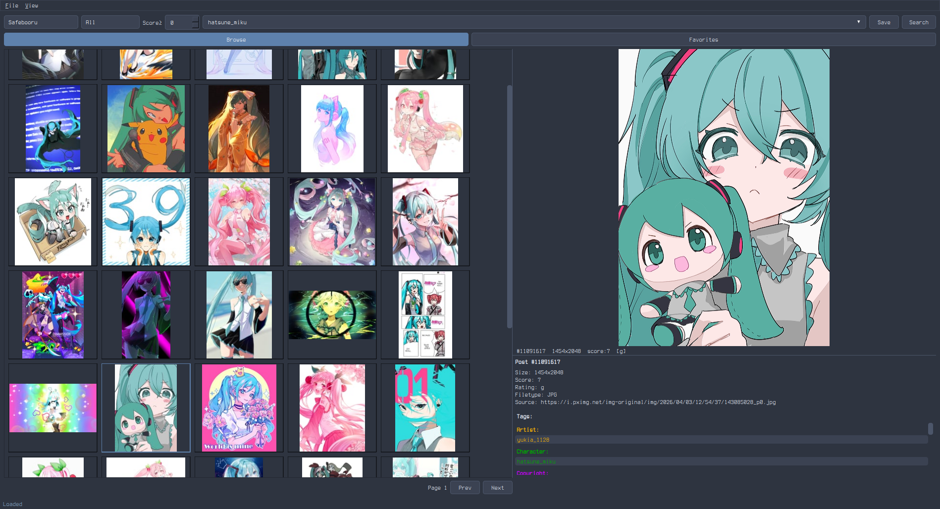 |
| Catppuccin Mocha | [catppuccin-mocha.qss](catppuccin-mocha.qss) |
|
| Catppuccin Mocha | [catppuccin-mocha.qss](catppuccin-mocha.qss) | 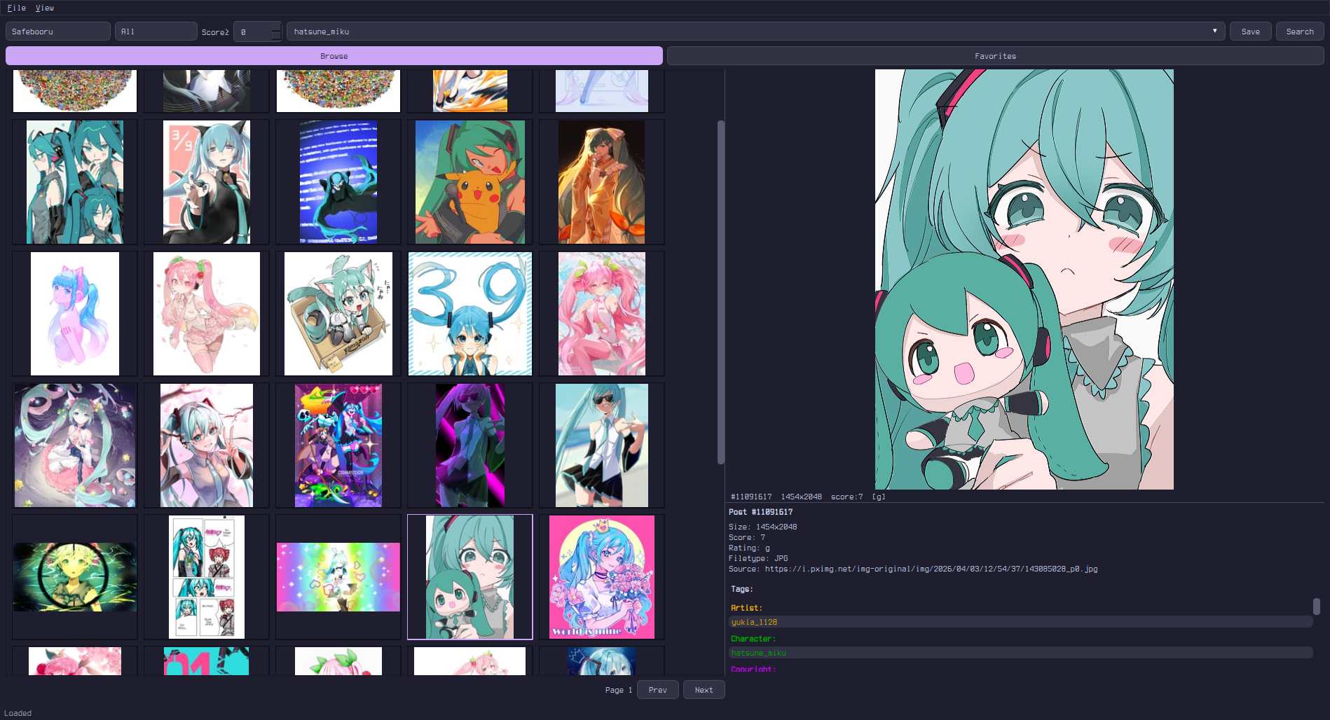 |
| Gruvbox | [gruvbox.qss](gruvbox.qss) |
|
| Gruvbox | [gruvbox.qss](gruvbox.qss) | 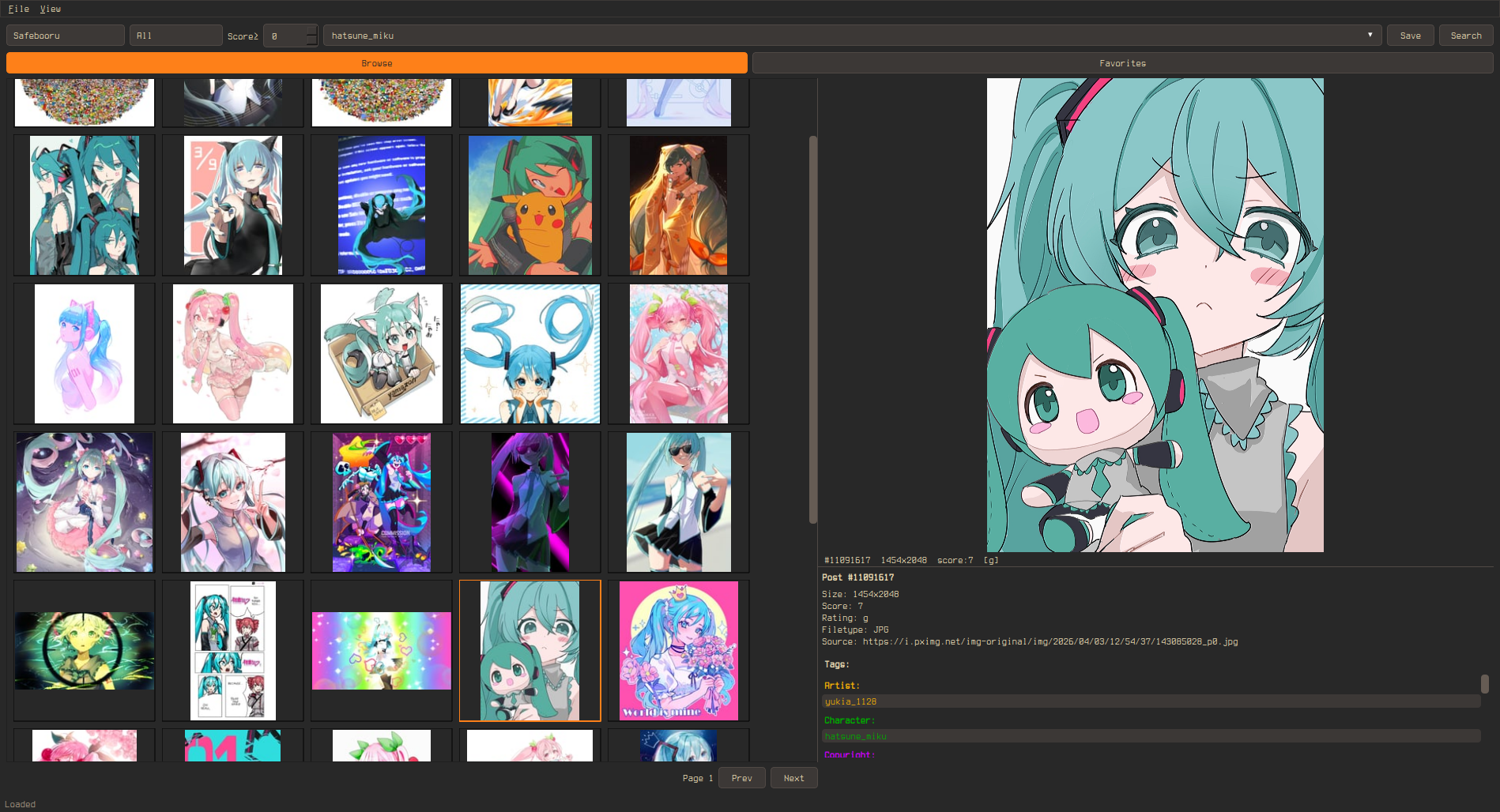 |
| Solarized Dark | [solarized-dark.qss](solarized-dark.qss) |
|
| Solarized Dark | [solarized-dark.qss](solarized-dark.qss) | 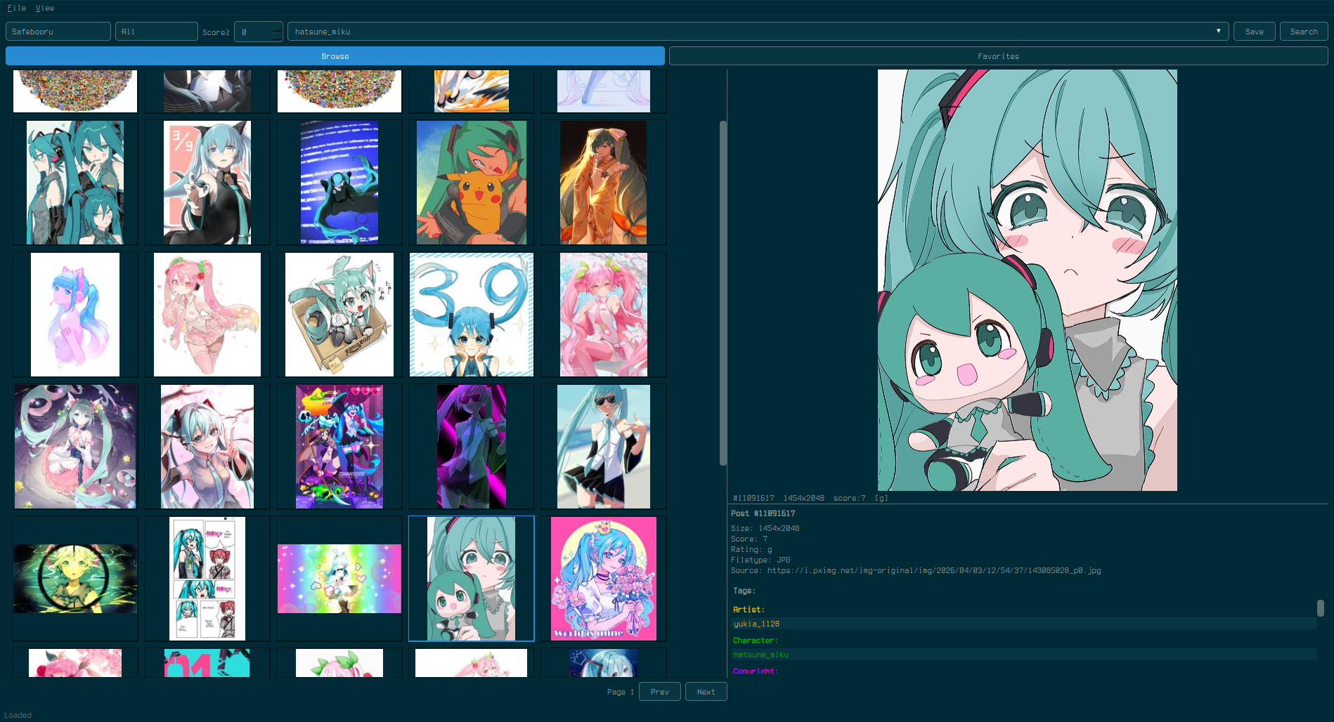 |
| Tokyo Night | [tokyo-night.qss](tokyo-night.qss) |
|
| Tokyo Night | [tokyo-night.qss](tokyo-night.qss) | 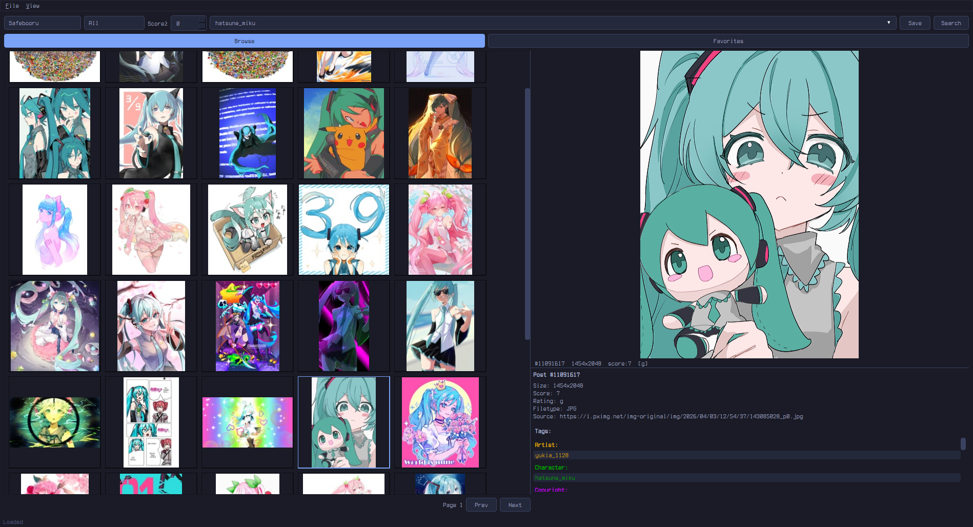 |
| Everforest | [everforest.qss](everforest.qss) |
|
| Everforest | [everforest.qss](everforest.qss) | 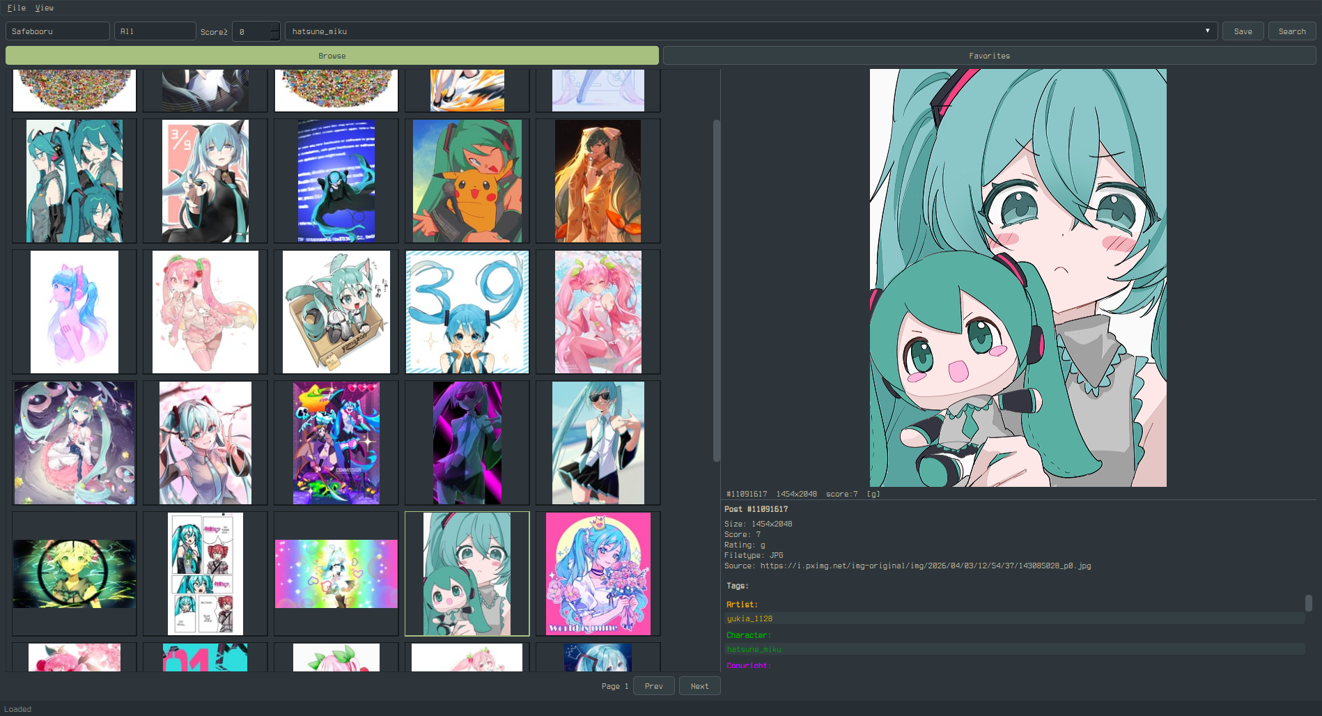 |
## Widget Targets
### Global
```css
QWidget {
background-color: #282828;
color: #ebdbb2;
font-size: 13px;
font-family: monospace;
selection-background-color: #fe8019; /* grid selection border + hover highlight */
selection-color: #282828;
}
```
### Buttons
```css
QPushButton {
background-color: #333;
color: #fff;
border: 1px solid #555;
border-radius: 4px;
padding: 5px 14px;
}
QPushButton:hover { background-color: #444; }
QPushButton:pressed { background-color: #555; }
QPushButton:checked { background-color: #0078d7; } /* Active tab (Browse/Bookmarks/Library), Autoplay, Loop toggles */
```
**Note:** Qt's QSS does not support the CSS `content` property, so you cannot replace button text (e.g. "Play" → "") via stylesheet alone. However, you can use a Nerd Font to change how unicode characters render:
```css
QPushButton {
font-family: "JetBrainsMono Nerd Font", monospace;
}
```
To use icon buttons, you would need to modify the Python source code directly — the button labels are set in `preview.py` via `QPushButton("Play")` etc.
### Text Inputs
```css
QLineEdit, QTextEdit {
background-color: #1a1a1a;
color: #fff;
border: 1px solid #555;
border-radius: 4px;
padding: 4px 8px;
}
QLineEdit:focus, QTextEdit:focus {
border-color: #0078d7;
}
```
### Dropdowns
```css
QComboBox {
background-color: #333;
color: #fff;
border: 1px solid #555;
border-radius: 4px;
padding: 3px 6px;
}
QComboBox::drop-down {
border: none;
width: 20px;
}
QComboBox QAbstractItemView {
background-color: #333;
color: #fff;
border: 1px solid #555;
selection-background-color: #444;
}
```
### Spin Box (Score Filter)
```css
QSpinBox {
background-color: #333;
color: #fff;
border: 1px solid #555;
border-radius: 2px;
}
```
### Scrollbars
```css
QScrollBar:vertical {
background: #1a1a1a;
width: 10px;
border: none;
}
QScrollBar::handle:vertical {
background: #555;
border-radius: 4px;
min-height: 20px;
}
QScrollBar::handle:vertical:hover { background: #0078d7; }
QScrollBar::add-line:vertical, QScrollBar::sub-line:vertical { height: 0; }
QScrollBar:horizontal {
background: #1a1a1a;
height: 10px;
}
QScrollBar::handle:horizontal {
background: #555;
border-radius: 4px;
}
QScrollBar::add-line:horizontal, QScrollBar::sub-line:horizontal { width: 0; }
```
### Menu Bar & Context Menus
```css
QMenuBar {
background-color: #1a1a1a;
color: #fff;
}
QMenuBar::item:selected { background-color: #333; }
QMenu {
background-color: #1a1a1a;
color: #fff;
border: 1px solid #333;
}
QMenu::item:selected { background-color: #333; }
```
### Status Bar
```css
QStatusBar {
background-color: #1a1a1a;
color: #888;
}
```
### Splitter Handle
```css
QSplitter::handle {
background: #555;
width: 2px;
}
```
### Tab Bar (Settings Dialog)
```css
QTabBar::tab {
background: #333;
color: #fff;
border: 1px solid #555;
padding: 6px 16px;
}
QTabBar::tab:selected {
background: #444;
color: #0078d7;
}
```
### Video Player Controls
The preview panel's video controls bar uses a translucent overlay style by default (`rgba(0,0,0,160)` background, white text). This is styled internally and **overrides QSS** for the controls bar. The seek/volume sliders and buttons inside the controls bar use a built-in dark overlay theme.
To override the preview controls bar background in QSS:
```css
QWidget#_preview_controls {
background: rgba(40, 40, 40, 200); /* your custom translucent bg */
}
```
Standard slider styling still applies outside the controls bar:
```css
QSlider::groove:horizontal {
background: #333;
height: 4px;
border-radius: 2px;
}
QSlider::handle:horizontal {
background: #0078d7;
width: 12px;
margin: -4px 0;
border-radius: 6px;
}
```
### Popout Overlay
The popout (fullscreen preview) toolbar and video controls float over the media with a translucent background and auto-hide after 2 seconds of no mouse activity. Mouse movement or Ctrl+H toggles them.
These overlays use internal styling that overrides QSS. To customize:
```css
/* Popout top toolbar */
QWidget#_slideshow_toolbar {
background: rgba(40, 40, 40, 200);
}
/* Popout bottom video controls */
QWidget#_slideshow_controls {
background: rgba(40, 40, 40, 200);
}
```
Buttons and labels inside both overlays inherit a white-on-transparent style. To override:
```css
QWidget#_slideshow_toolbar QPushButton {
border: 1px solid rgba(255, 255, 255, 120);
color: #ccc;
}
QWidget#_slideshow_controls QPushButton {
border: 1px solid rgba(255, 255, 255, 120);
color: #ccc;
}
```
### Preview Toolbar
The preview panel has an action toolbar (Bookmark, Save, BL Tag, BL Post, Popout) that appears above the media when a post is active. This toolbar uses the app's default button styling.
The toolbar does not have a named object ID — it inherits the app's `QPushButton` styles directly.
### Progress Bar (Download)
```css
QProgressBar {
background-color: #333;
border: none;
}
QProgressBar::chunk {
background-color: #0078d7;
}
```
### Tooltips
```css
QToolTip {
background-color: #333;
color: #fff;
border: 1px solid #555;
padding: 4px;
}
```
### Labels
```css
QLabel {
background: transparent; /* important: prevents opaque label backgrounds */
}
```
### Rubber Band Selection
Click and drag on empty grid space to select multiple thumbnails. The rubber band uses the system's default `QRubberBand` style, which can be customized:
```css
QRubberBand {
background: rgba(0, 120, 215, 40);
border: 1px solid #0078d7;
}
```
### Thumbnail Indicators
```css
ThumbnailWidget {
qproperty-savedColor: #22cc22; /* green dot: saved to library */
qproperty-bookmarkedColor: #ffcc00; /* yellow star: bookmarked */
}
```
## States
| State | Description |
|-------|-------------|
| `:hover` | Mouse over |
| `:pressed` | Mouse down |
| `:focus` | Keyboard focus |
| `:checked` | Toggle buttons (Browse/Favorites) |
| `:selected` | Selected menu item or tab |
| `:disabled` | Grayed out |
## Notes
- `selection-background-color` on `QWidget` controls the **grid thumbnail selection border** and **hover highlight** (lighter version auto-derived)
- Setting a custom QSS automatically switches to the Fusion Qt style for consistent rendering
- Tag category colors (Artist, Character, etc.) in the info panel are set in code, not via QSS
- Saved dot (green) and bookmark star (yellow) are QSS-controllable via `qproperty-savedColor` and `qproperty-bookmarkedColor` on `ThumbnailWidget`
- Use `QLabel { background: transparent; }` to prevent labels from getting opaque backgrounds
|
## Widget Targets
### Global
```css
QWidget {
background-color: #282828;
color: #ebdbb2;
font-size: 13px;
font-family: monospace;
selection-background-color: #fe8019; /* grid selection border + hover highlight */
selection-color: #282828;
}
```
### Buttons
```css
QPushButton {
background-color: #333;
color: #fff;
border: 1px solid #555;
border-radius: 4px;
padding: 5px 14px;
}
QPushButton:hover { background-color: #444; }
QPushButton:pressed { background-color: #555; }
QPushButton:checked { background-color: #0078d7; } /* Active tab (Browse/Bookmarks/Library), Autoplay, Loop toggles */
```
**Note:** Qt's QSS does not support the CSS `content` property, so you cannot replace button text (e.g. "Play" → "") via stylesheet alone. However, you can use a Nerd Font to change how unicode characters render:
```css
QPushButton {
font-family: "JetBrainsMono Nerd Font", monospace;
}
```
To use icon buttons, you would need to modify the Python source code directly — the button labels are set in `preview.py` via `QPushButton("Play")` etc.
### Text Inputs
```css
QLineEdit, QTextEdit {
background-color: #1a1a1a;
color: #fff;
border: 1px solid #555;
border-radius: 4px;
padding: 4px 8px;
}
QLineEdit:focus, QTextEdit:focus {
border-color: #0078d7;
}
```
### Dropdowns
```css
QComboBox {
background-color: #333;
color: #fff;
border: 1px solid #555;
border-radius: 4px;
padding: 3px 6px;
}
QComboBox::drop-down {
border: none;
width: 20px;
}
QComboBox QAbstractItemView {
background-color: #333;
color: #fff;
border: 1px solid #555;
selection-background-color: #444;
}
```
### Spin Box (Score Filter)
```css
QSpinBox {
background-color: #333;
color: #fff;
border: 1px solid #555;
border-radius: 2px;
}
```
### Scrollbars
```css
QScrollBar:vertical {
background: #1a1a1a;
width: 10px;
border: none;
}
QScrollBar::handle:vertical {
background: #555;
border-radius: 4px;
min-height: 20px;
}
QScrollBar::handle:vertical:hover { background: #0078d7; }
QScrollBar::add-line:vertical, QScrollBar::sub-line:vertical { height: 0; }
QScrollBar:horizontal {
background: #1a1a1a;
height: 10px;
}
QScrollBar::handle:horizontal {
background: #555;
border-radius: 4px;
}
QScrollBar::add-line:horizontal, QScrollBar::sub-line:horizontal { width: 0; }
```
### Menu Bar & Context Menus
```css
QMenuBar {
background-color: #1a1a1a;
color: #fff;
}
QMenuBar::item:selected { background-color: #333; }
QMenu {
background-color: #1a1a1a;
color: #fff;
border: 1px solid #333;
}
QMenu::item:selected { background-color: #333; }
```
### Status Bar
```css
QStatusBar {
background-color: #1a1a1a;
color: #888;
}
```
### Splitter Handle
```css
QSplitter::handle {
background: #555;
width: 2px;
}
```
### Tab Bar (Settings Dialog)
```css
QTabBar::tab {
background: #333;
color: #fff;
border: 1px solid #555;
padding: 6px 16px;
}
QTabBar::tab:selected {
background: #444;
color: #0078d7;
}
```
### Video Player Controls
The preview panel's video controls bar uses a translucent overlay style by default (`rgba(0,0,0,160)` background, white text). This is styled internally and **overrides QSS** for the controls bar. The seek/volume sliders and buttons inside the controls bar use a built-in dark overlay theme.
To override the preview controls bar background in QSS:
```css
QWidget#_preview_controls {
background: rgba(40, 40, 40, 200); /* your custom translucent bg */
}
```
Standard slider styling still applies outside the controls bar:
```css
QSlider::groove:horizontal {
background: #333;
height: 4px;
border-radius: 2px;
}
QSlider::handle:horizontal {
background: #0078d7;
width: 12px;
margin: -4px 0;
border-radius: 6px;
}
```
### Popout Overlay
The popout (fullscreen preview) toolbar and video controls float over the media with a translucent background and auto-hide after 2 seconds of no mouse activity. Mouse movement or Ctrl+H toggles them.
These overlays use internal styling that overrides QSS. To customize:
```css
/* Popout top toolbar */
QWidget#_slideshow_toolbar {
background: rgba(40, 40, 40, 200);
}
/* Popout bottom video controls */
QWidget#_slideshow_controls {
background: rgba(40, 40, 40, 200);
}
```
Buttons and labels inside both overlays inherit a white-on-transparent style. To override:
```css
QWidget#_slideshow_toolbar QPushButton {
border: 1px solid rgba(255, 255, 255, 120);
color: #ccc;
}
QWidget#_slideshow_controls QPushButton {
border: 1px solid rgba(255, 255, 255, 120);
color: #ccc;
}
```
### Preview Toolbar
The preview panel has an action toolbar (Bookmark, Save, BL Tag, BL Post, Popout) that appears above the media when a post is active. This toolbar uses the app's default button styling.
The toolbar does not have a named object ID — it inherits the app's `QPushButton` styles directly.
### Progress Bar (Download)
```css
QProgressBar {
background-color: #333;
border: none;
}
QProgressBar::chunk {
background-color: #0078d7;
}
```
### Tooltips
```css
QToolTip {
background-color: #333;
color: #fff;
border: 1px solid #555;
padding: 4px;
}
```
### Labels
```css
QLabel {
background: transparent; /* important: prevents opaque label backgrounds */
}
```
### Rubber Band Selection
Click and drag on empty grid space to select multiple thumbnails. The rubber band uses the system's default `QRubberBand` style, which can be customized:
```css
QRubberBand {
background: rgba(0, 120, 215, 40);
border: 1px solid #0078d7;
}
```
### Thumbnail Indicators
```css
ThumbnailWidget {
qproperty-savedColor: #22cc22; /* green dot: saved to library */
qproperty-bookmarkedColor: #ffcc00; /* yellow star: bookmarked */
}
```
## States
| State | Description |
|-------|-------------|
| `:hover` | Mouse over |
| `:pressed` | Mouse down |
| `:focus` | Keyboard focus |
| `:checked` | Toggle buttons (Browse/Favorites) |
| `:selected` | Selected menu item or tab |
| `:disabled` | Grayed out |
## Notes
- `selection-background-color` on `QWidget` controls the **grid thumbnail selection border** and **hover highlight** (lighter version auto-derived)
- Setting a custom QSS automatically switches to the Fusion Qt style for consistent rendering
- Tag category colors (Artist, Character, etc.) in the info panel are set in code, not via QSS
- Saved dot (green) and bookmark star (yellow) are QSS-controllable via `qproperty-savedColor` and `qproperty-bookmarkedColor` on `ThumbnailWidget`
- Use `QLabel { background: transparent; }` to prevent labels from getting opaque backgrounds